On Site Medical & Safety
A company with a strong reputation needed a name and identity that made its work easier to understand — so Pharma-Safe became On Site Medical & Safety.
Who They Are
On Site Medical & Safety is an occupational health and safety company based in Lafayette, Louisiana, serving clients in the oil and gas industry and other demanding work environments.
Before the rebrand, the company was known as Pharma-Safe. The team had the experience, the services, and the industry trust — but the name was creating confusion. Many prospective clients assumed the company offered pharmaceutical services or operated primarily in the pharmaceutical space.
That misunderstanding was getting in the way. The company needed an identity that better reflected what it actually provides: medical, safety, and occupational health support delivered where clients need it most.
A new name needed a visual identity strong enough to carry the shift.
Pharma-Safe was entering a new chapter as On Site Medical & Safety. The brand had to feel clear, professional, and approachable while still holding authority in an industry where safety, trust, and reliability matter.
The previous identity no longer matched the company's position in the market. It did not clearly communicate the scope of the work, and it did not give the business the flexibility it needed across digital, print, uniforms, signage, presentations, and future marketing materials.
The company was ready for a clearer name. It needed a brand identity built to match.

Clarity Over Confusion
The strategy started with clarity. When someone saw the name, logo, and visual system, they needed to understand immediately that this was not a pharmaceutical company. This was a field-ready medical and safety partner for high-demand industries.
At the same time, the brand could not feel cold or overly clinical. On Site works in serious environments, but its value comes from practical support, responsiveness, and trust. The identity needed to balance professionalism with approachability.
- Clarity over confusion
- Authority without stiffness
- Approachability without losing professionalism
- A logo system built for real-world use
- A visual identity that supports the next stage of growth
A Mark With Meaning
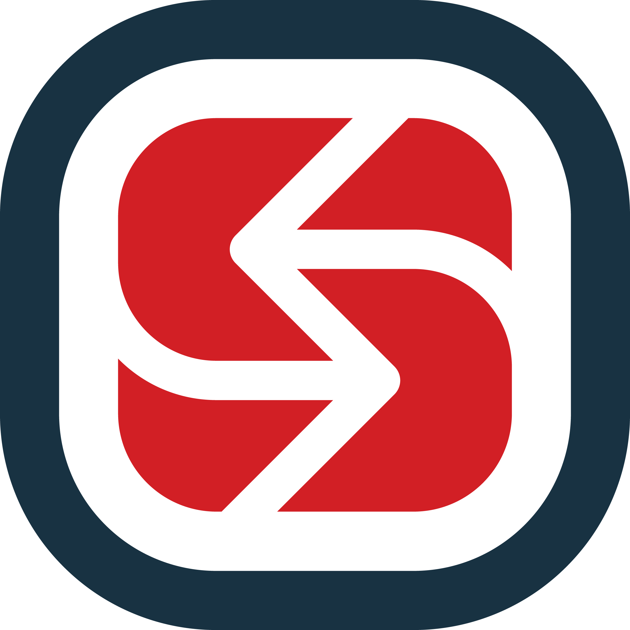
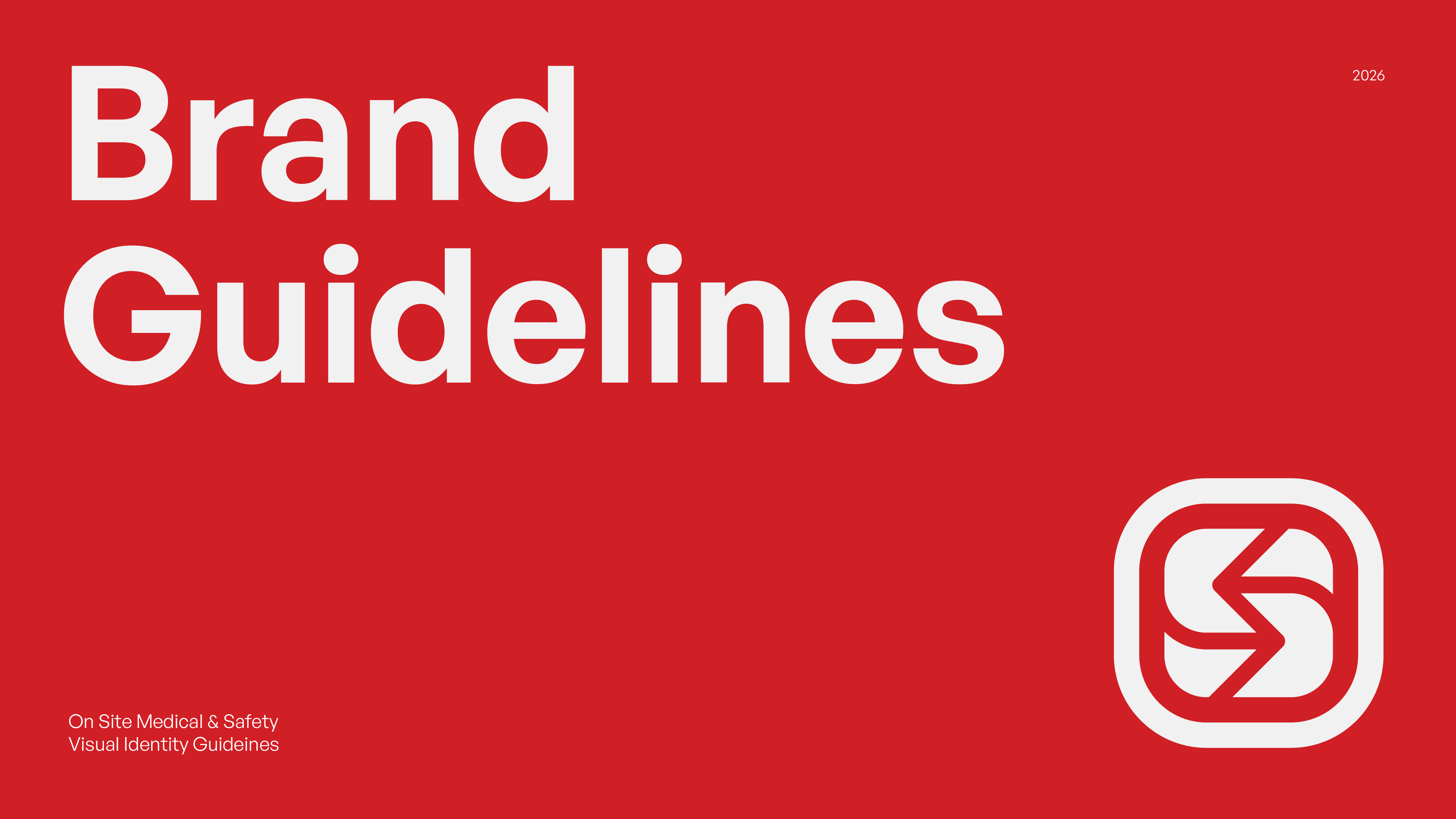
The icon features a bold central graphic enclosed within a rounded frame — more than a decorative element, it is a literal representation of the brand's ethos. The negative space and forms subtly suggest the letter "S," anchoring the mark to the "Site" and "Safety" pillars of the organization.
Central to the design are two directional arrows. These symbolize a "constant presence" — reinforcing the promise behind the name On Site: wherever a need arises, the team is already there or in active motion toward the solution.
The heavy outer border provides a sense of containment and protection, reflecting the safety-first mission of the company.
A Logo System, Not Just a Logo
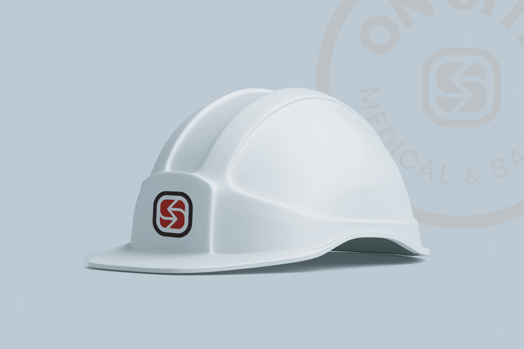
The logo needed to work in more places than a single website header. It had to hold up across uniforms, printed materials, social media, presentations, signage, and other applications the company relies on as it moves forward.
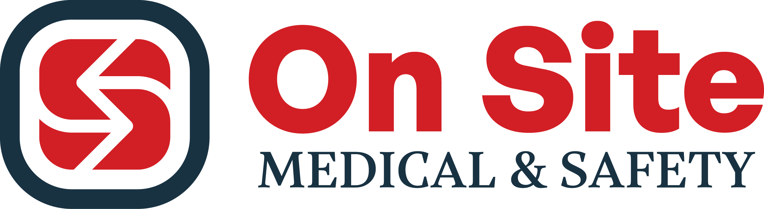
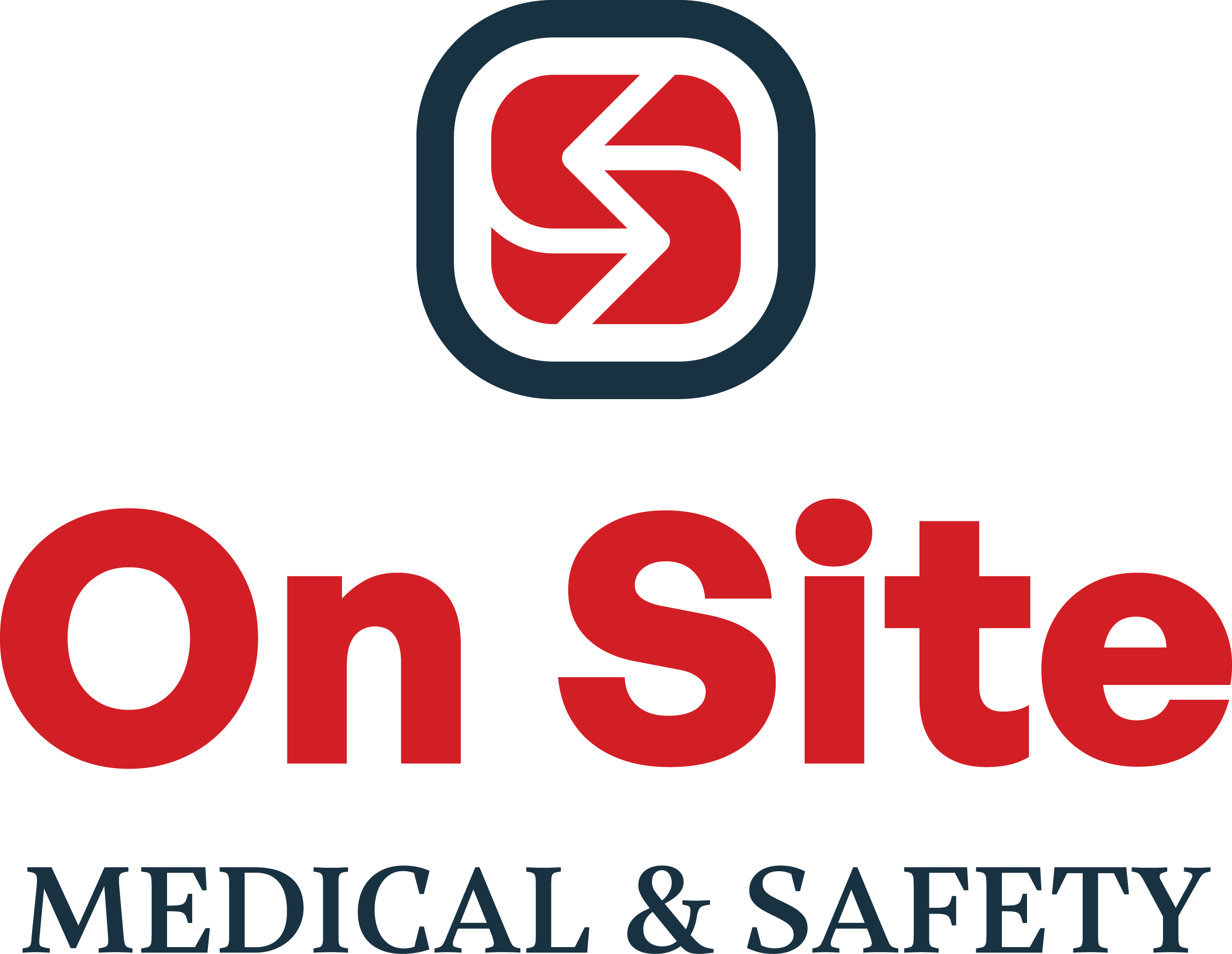
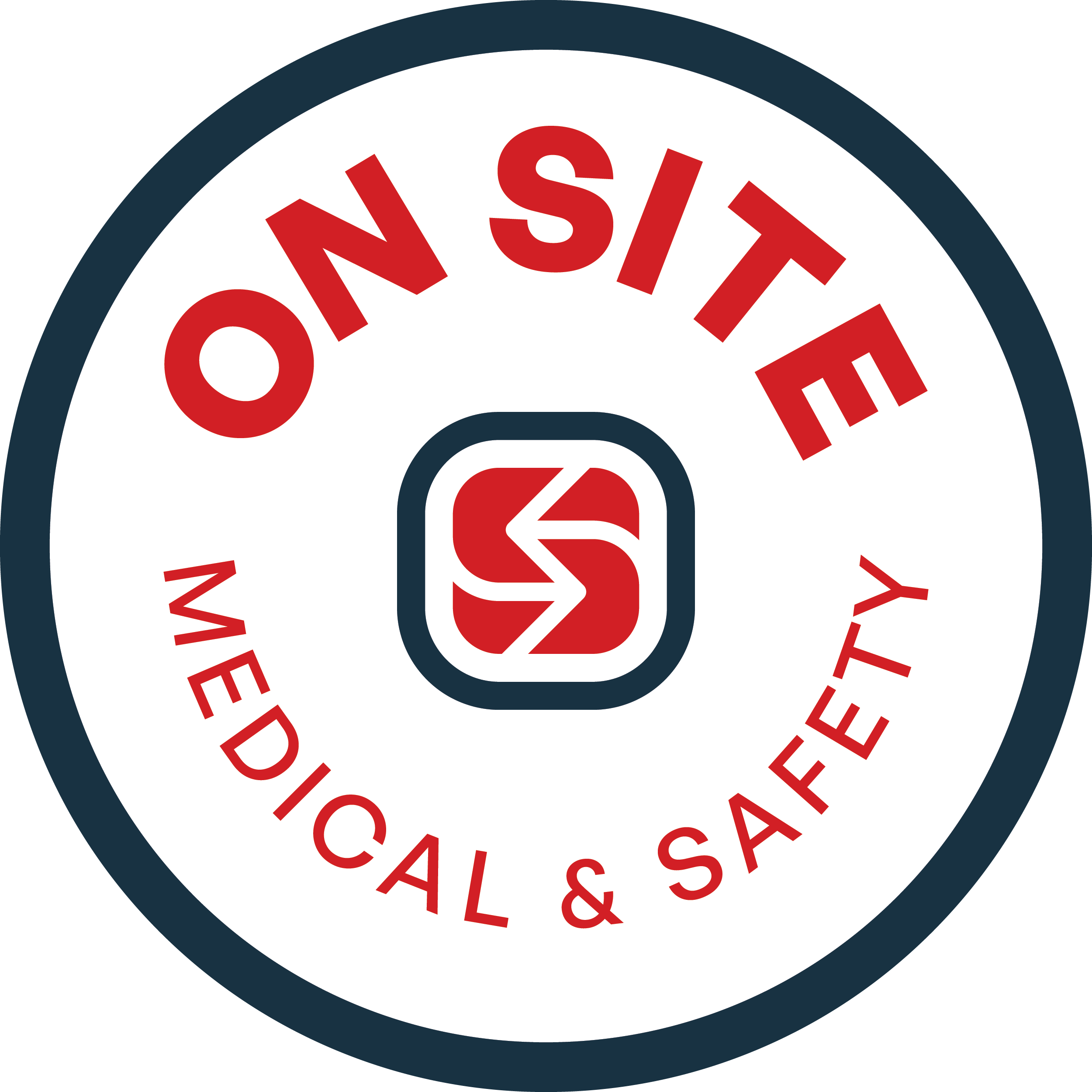
We built a flexible lockup system — primary, stacked, wordmark, and badge — so the brand stays recognizable across every format while still feeling connected to the same identity.
Out In the Field
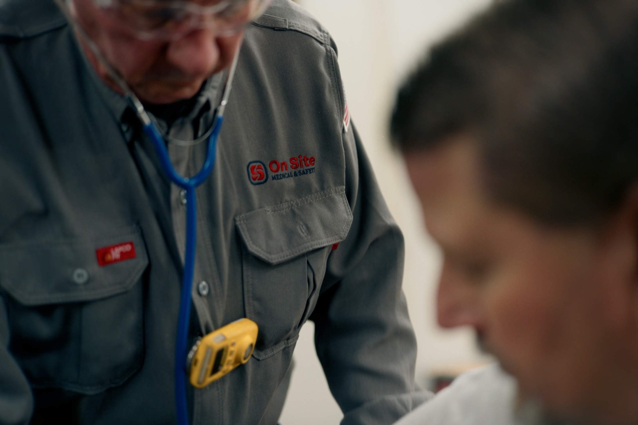
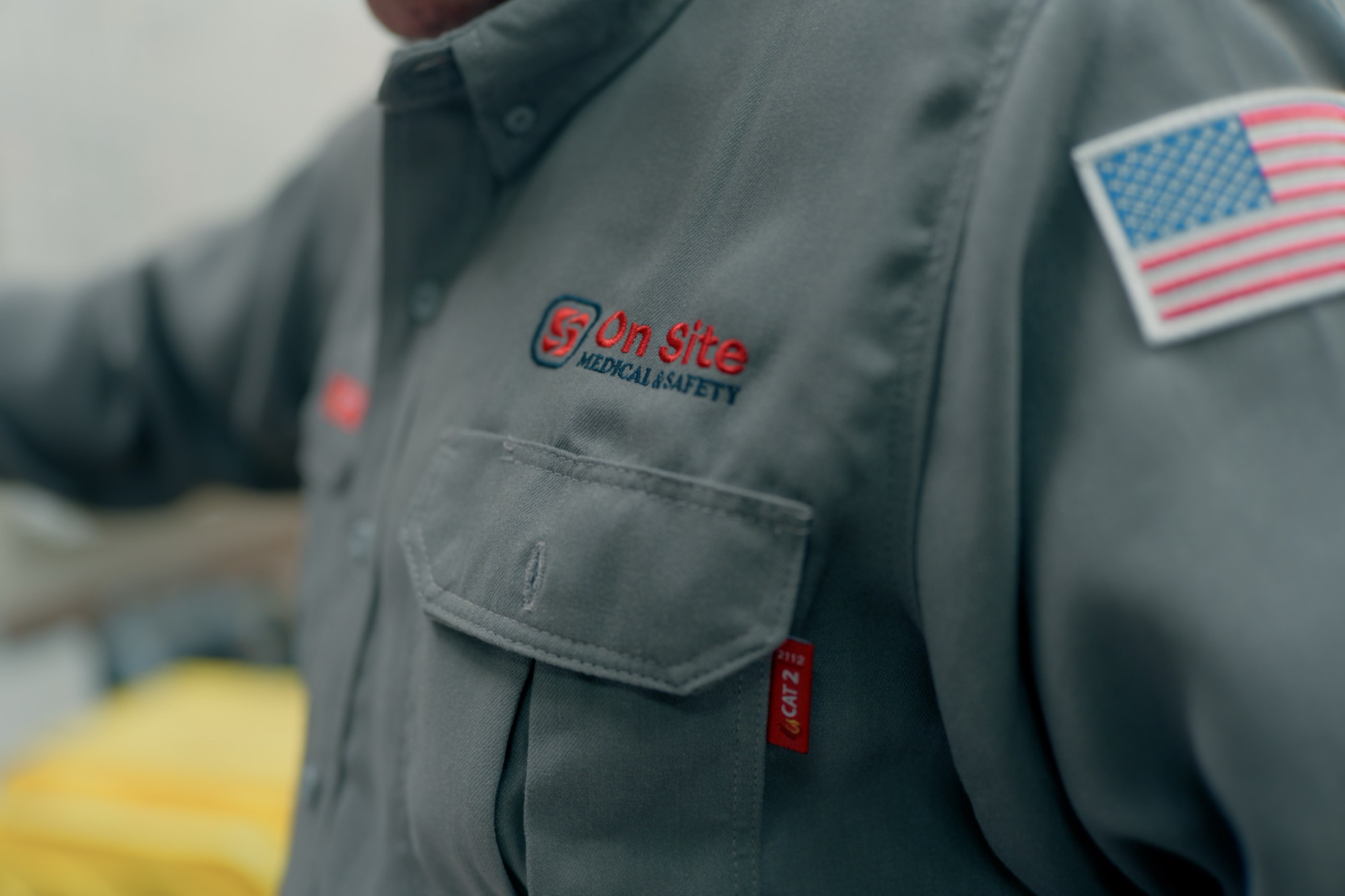
A brand only proves itself where the work happens. Embroidered onto flame-resistant field shirts, the primary lockup holds up exactly where On Site's team spends its days — on rigs, in plants, and anywhere occupational health and safety is on the line.
Color Palette
A restrained, four-color system gives the brand its confidence. Safety Red carries urgency and response; Deepsea Navy supplies structure, trust, and the protective frame of the mark. White and black keep the system clean, legible, and easy to apply anywhere.
A Voice That Holds Up
General Sans anchors the system as the primary voice — a clean, modern sans that reads clearly from a business card to a billboard. Gambetta serves as a serif accent, echoing the engraved "Medical & Safety" line in the wordmark and adding a note of craft and authority.
Wherever the work is.
Aa Bb Cc Dd Ee Ff Gg Hh Ii Jj Kk Ll Mm Nn Oo Pp Qq Rr Ss Tt Uu Vv Ww Xx Yy Zz
Medical & Safety
Aa Bb Cc Dd Ee Ff Gg Hh Ii Jj Kk Ll Mm Nn Oo Pp Qq Rr Ss Tt Uu Vv Ww Xx Yy Zz
An Identity That Fits
Beyond the logo itself, we developed a broader brand identity that helped the new name feel established from the start. The visual direction moved the company away from the limitations of the Pharma-Safe identity and toward one that better reflects its current market position.
The new identity is cleaner, more versatile, and better suited to communicate medical and safety services without creating confusion around pharmaceuticals. The goal was not a brand refresh for the sake of novelty, but a visual system that finally matched who they really are.
We built it with practical use in mind — polished enough to support the company's credibility, clear enough to explain the new name, and flexible enough to keep working across marketing materials, internal documents, sales conversations, digital platforms, and public-facing touchpoints as the business expands. We delivered a Brand Guidelines document so the new visual identity can be applied uniformly across the organization.
Impact
As Pharma-Safe entered its new era as On Site Medical & Safety, the company gained a brand identity that better matched its services, reputation, and future direction.
The new identity is more approachable, more authoritative, and more versatile than the previous brand. It gives the company a clearer way to show up across sales materials, digital platforms, team communications, and future marketing efforts. The response has already been positive, both inside and outside the company.
For a business that was once misunderstood because of its name, that clarity matters. The result is a brand identity built for the company On Site Medical & Safety has become: trusted, capable, and ready for what comes next.
What We Learned
Clarity is part of the brand
The rebrand removed confusion around pharmaceutical services and gave the company a name and identity that reflect its actual work.
A logo system needs flexibility
The identity was built to work across digital, print, uniforms, signage, presentations, and other real-world applications.
Professional does not mean cold
The brand carries authority in a serious industry while still feeling approachable, practical, and human.
The right identity supports growth
On Site now has a visual foundation built to scale with its next stage of visibility and expansion.