Straws and Scoops
A dirty soda shop's playful brand, refined before launch so it could show up clean on every cup, sign, and screen.

What happens when a logo that feels fun in concept can't hold up on a cup, a sign, a shirt, or a screen?

The Strategy
Straws and Scoops was preparing to launch a dirty soda shop, but their existing logo and visuals needed refinement before the brand started showing up in public. The original branding had too much complexity and too many colors to work well across digital and print applications.
The business was still pre-launch, which made the timing of the refresh especially valuable. Straws and Scoops had not yet invested in major brand applications, so there was still an opportunity to strengthen the identity before it became costly or difficult to change. A logo that feels meaningful in concept can still create problems when it has to work on signage, social media, cups, apparel, menus, printed materials, and a website.
Page50's role was to offer honest consultation without dismissing the client's original vision. The goal was to preserve the playful spirit of the brand while giving Straws and Scoops a cleaner visual identity that would be easier to use, easier to recognize, and better suited for launch.
Process & Insights
Analyze the problem. Page50 sat down with Straws and Scoops to understand their goals, objectives, and vision for the business. Through that conversation, we were able to identify where the existing branding could create challenges and ask the practical questions that had not yet been fully considered.
Provide consultation. At first, Straws and Scoops was not planning to rework their branding. We helped guide the conversation by explaining the value of a cleaner, more flexible logo system. The recommendation was not about changing the brand for the sake of change. It was about making sure the identity could hold up wherever the business needed to use it.
Execute the plan. We assigned one of our skilled designers to take the client's goals and create branding that better fit the business. Through a couple rounds of revisions, the logo system was refined until Straws and Scoops had a visual identity that felt clean, playful, and ready for real-world use.
Primary Logo
The Page50 team created a refreshed primary logo for Straws and Scoops: a cleaner, more versatile mark that kept the fun of the original without the complexity that made it hard to reproduce.
The final identity gave the business a stronger brand system before launch, ready to show up consistently across website graphics, signage, uniforms, social media, print materials, and future marketing needs.
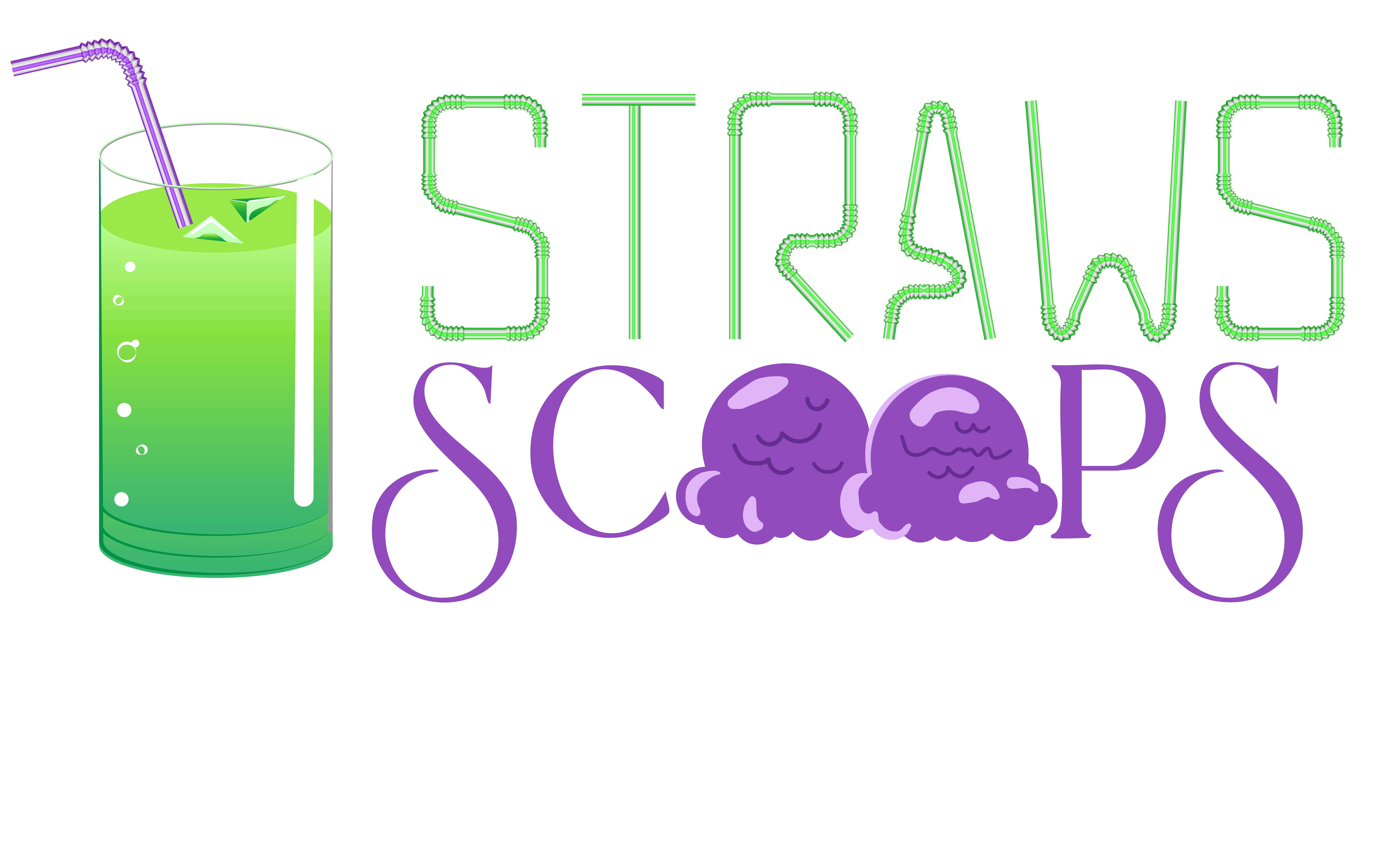 Previous Logo
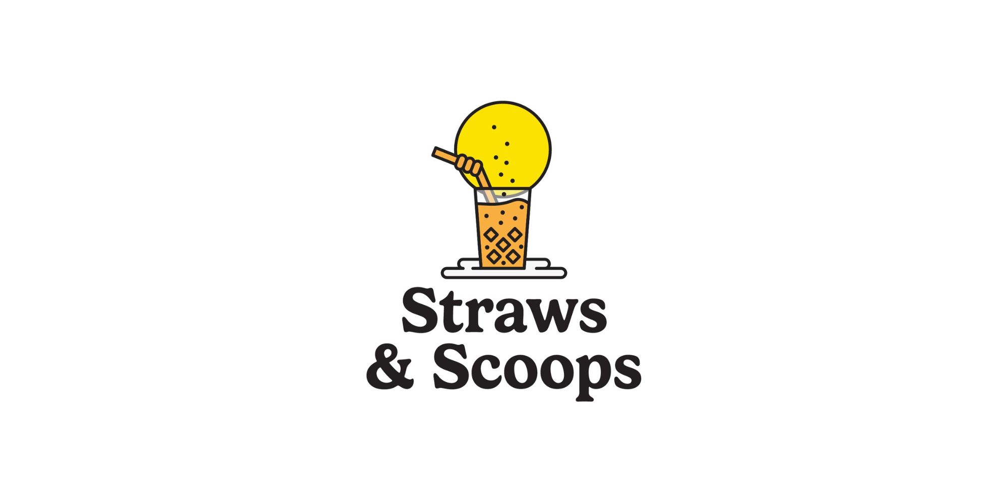 New Logo
Secondary Logo
A single mark can't cover every surface a new shop needs. Alongside the primary logo, we built a secondary horizontal lockup that shares the same DNA — the same glass, the same straw, the same playful type — arranged to fit the wide, tight spaces where a stacked mark would struggle.
With both a primary and secondary mark, Straws and Scoops had the flexibility to show up consistently wherever the brand needed to go.
Ready for Launch
The result was a stronger visual foundation for a new business: still fun, still approachable, but much easier to use wherever the brand needed to go.
Straws and Scoops opened its doors with an identity built for real-world use — one that reads as clearly on a storefront as it does on a straw wrapper.