Olde Wood Accents
A logo with decades of character, carefully sharpened so it reads as clearly on a phone screen as it does on a barn beam.
How do you modernize a logo that customers already love, without sanding away the very character that made them love it?
The Strategy
Olde Wood Accents built its name the slow way, one reclaimed beam and one satisfied customer at a time. The craftsmanship was never the problem. The logo was.
Years of additions had left the mark crowded with flourishes and fine detail. On a workshop sign it looked fine. Shrunk onto a business card, embroidered on a cap, or loaded onto a website, it turned to mud. A brand that prided itself on precision was being represented by something that blurred the moment it left the page.
So we resisted the easy answer. Starting over would have been faster, but it would have thrown out the equity the company had spent years earning. Instead we took a preservation-first approach: keep the soul of the original, lose the noise around it. Evolve the mark, don't replace it.
Logo Refresh
The original logo carried real warmth, the kind you can't fake and can't afford to lose. But warmth was doing battle with clutter. Intricate flourishes fought for attention, dense detail collapsed at small sizes, and a carefully built brand kept getting reduced to visual static.
We pulled the mark apart and asked a simple question of every element: is this character, or is this clutter? The flourishes that added nothing came off. Proportions were rebalanced. The pieces that gave the logo its identity were given room to breathe.
What's left still feels handcrafted, still feels like Olde Wood. It just holds together now, from a billboard down to a favicon, clean and confident at any size.
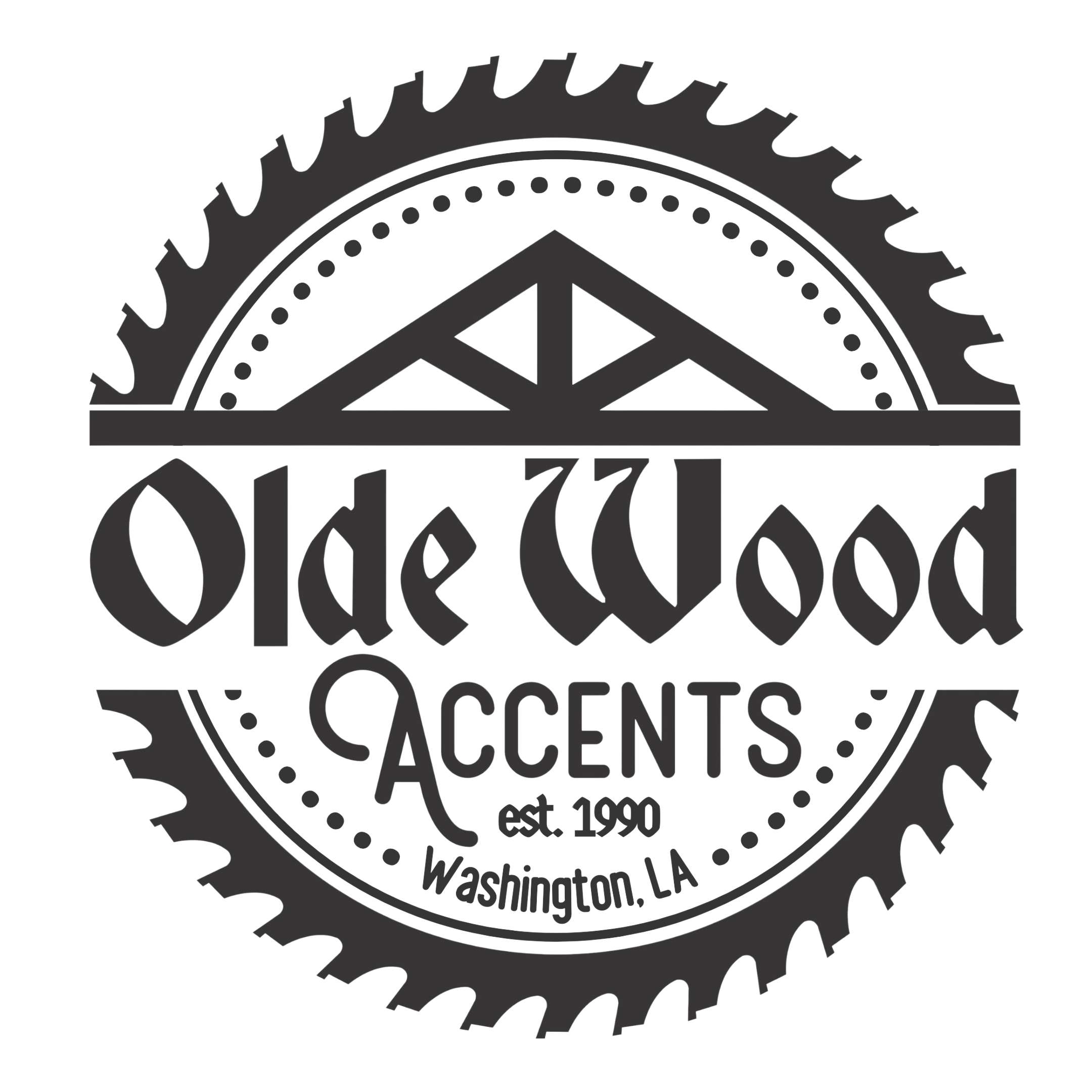 Previous Logo
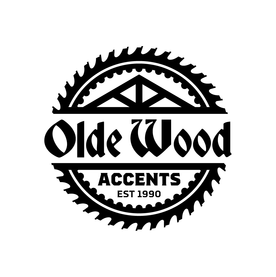 New Logo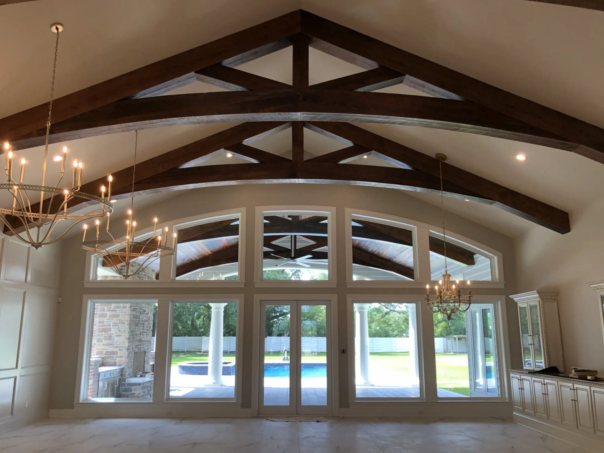
Secondary Logo
One mark, no matter how strong, can't be everywhere at once. A primary logo built to command a storefront has no business squeezing onto a stamp or a social avatar.
So we gave Olde Wood a second voice. The secondary mark shares the exact DNA of the primary, the same proportions, the same weight, the same character, but it's built to work in the tight, casual, and small-format spaces where the full logo would feel overbuilt.
Together the two marks cover the whole territory. Whatever the surface, whatever the size, the brand now shows up looking like itself.
Built to Last
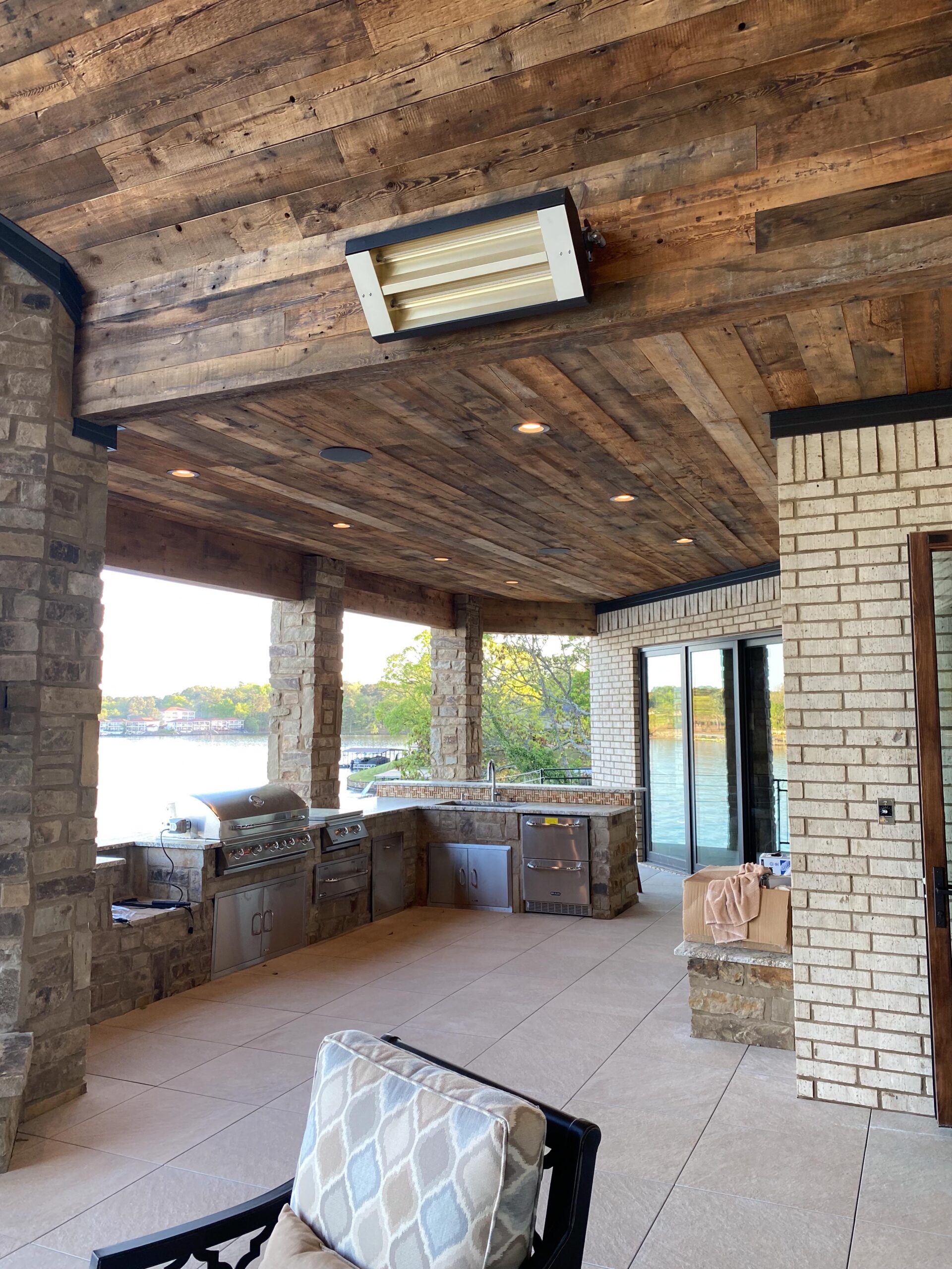
Olde Wood Accents now owns a logo system as durable as the materials it's named for. Versatile enough to live anywhere, distinctive enough to stand apart, and faithful enough to the original that longtime customers still recognize home.
The craftsmanship was always there. Now the mark finally matches it, and it's built to carry the brand for years to come.