Forward Data Consultants
A new consulting company with serious technical expertise needed a brand and website that made that expertise visible from the first impression.

Who They Are
Forward Data Consultants is a data-focused consulting company built around strategy, expertise, and practical problem-solving.
As a new company preparing to enter the market, Forward had the knowledge. They had the capability. What they didn't have yet was a public identity that could carry that credibility into sales conversations, digital touchpoints, and a formal launch.
There was no existing brand system to refine. No website to improve. No content library to draw from. Everything had to be created intentionally, from the logo and typography to the color palette, photography, brand guidelines, and website direction.
The goal was not only to make Forward look professional, but to build a brand foundation that felt as capable, intelligent, and trustworthy as the people behind it.
Forward needed to enter the market looking established before they had the benefit of years of public recognition.
That is a delicate balance. The brand needed to feel modern, sharp, and technically capable, but not cold. It needed to feel current, but not trendy. It needed to communicate intelligence without falling into the generic "tech company" look that so many brands in the space default to.
There was also a practical challenge: Forward had no original visual content. Without photography, brand assets, or a defined design system, the company risked launching with a website that felt abstract, stock-driven, or disconnected from the actual people behind the work.

What Success Looks Like
The project had a clear purpose: give Forward a complete, credible identity for launch.
Success meant building a visual system that could support the company across its website, marketing materials, sales conversations, print assets, and future growth.
The core objectives were clear:
- 01Create a complete visual identity from the ground up.
- 02Develop a brand that felt modern, professional, intelligent, and trustworthy.
- 03Avoid an overly flashy, generic, or “tech-bro” aesthetic.
- 04Capture original photography that supported the website and brand story.
- 05Provide Forward with usable brand assets for digital, print, and future marketing needs.
- 06Build a website presence that aligned with the new brand and gave the company a credible home online.
In short, Forward needed to look like a company ready to be taken seriously.

Strategy
Because Forward was starting from scratch, the discovery process mattered more than usual.
There was no old brand to audit. No existing website to diagnose. No long history of marketing materials to pull from. The work had to begin with listening: understanding Forward's goals, values, audience, services, and long-term vision.
Forward brought the subject-matter expertise. We brought the brand, web, content, and production strategy needed to translate that expertise into a clear public presence.
The central creative direction came down to balance. The brand needed to feel technical, but not sterile. Professional, but not generic. Modern, but not trendy in a way that would age quickly. Confident, but not loud. Every decision had to serve the same purpose: make Forward feel credible, capable, and human.
A few principles guided the work:
- Clarity over flash.
- Professionalism without stiffness.
- Technical credibility without coldness.
- Original visuals over generic stock imagery.
- A brand system built for long-term use, not just launch day.
During the process, the project also required a design direction change. Rather than forcing an early concept forward, we worked with the client and creative team to reassess, adjust, and keep refining until the final direction better matched Forward's goals.
A new company's identity has to feel right, not just look finished.
Brand Identity
Forward needed more than a logo. They needed a visual system that could make a new company feel coherent from day one.
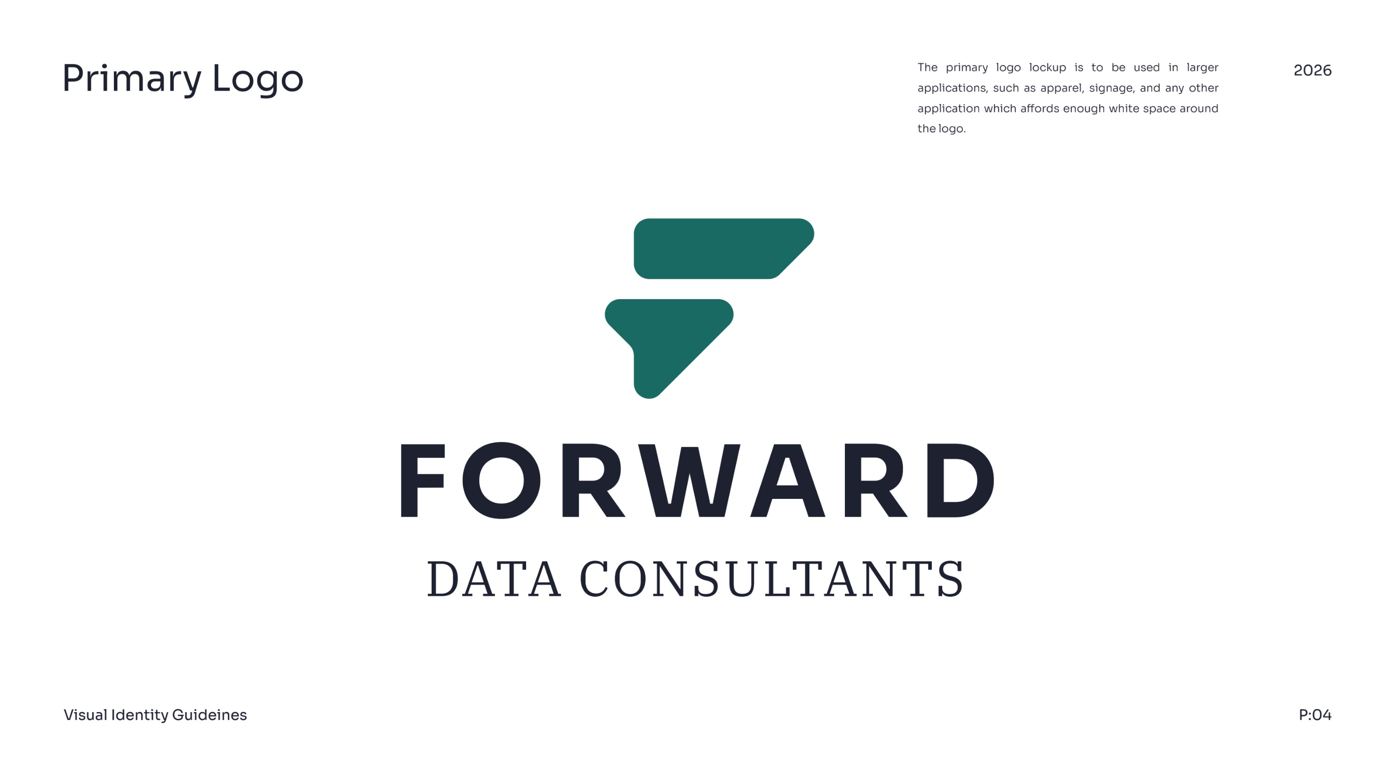
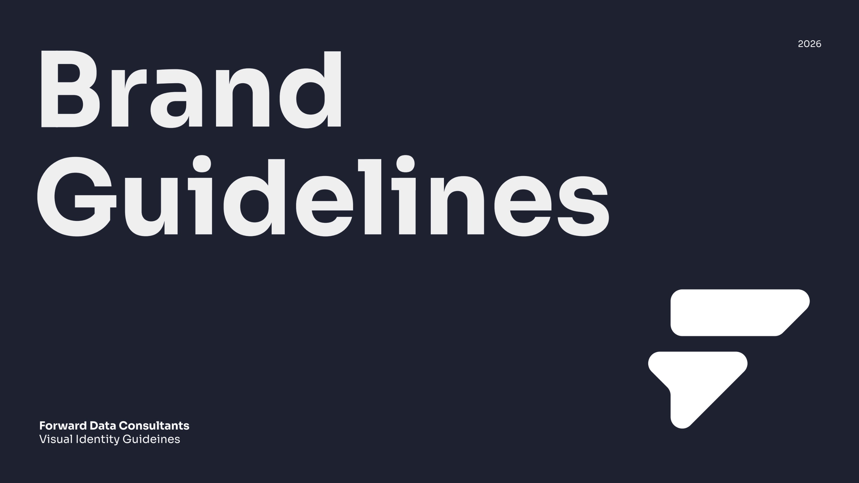
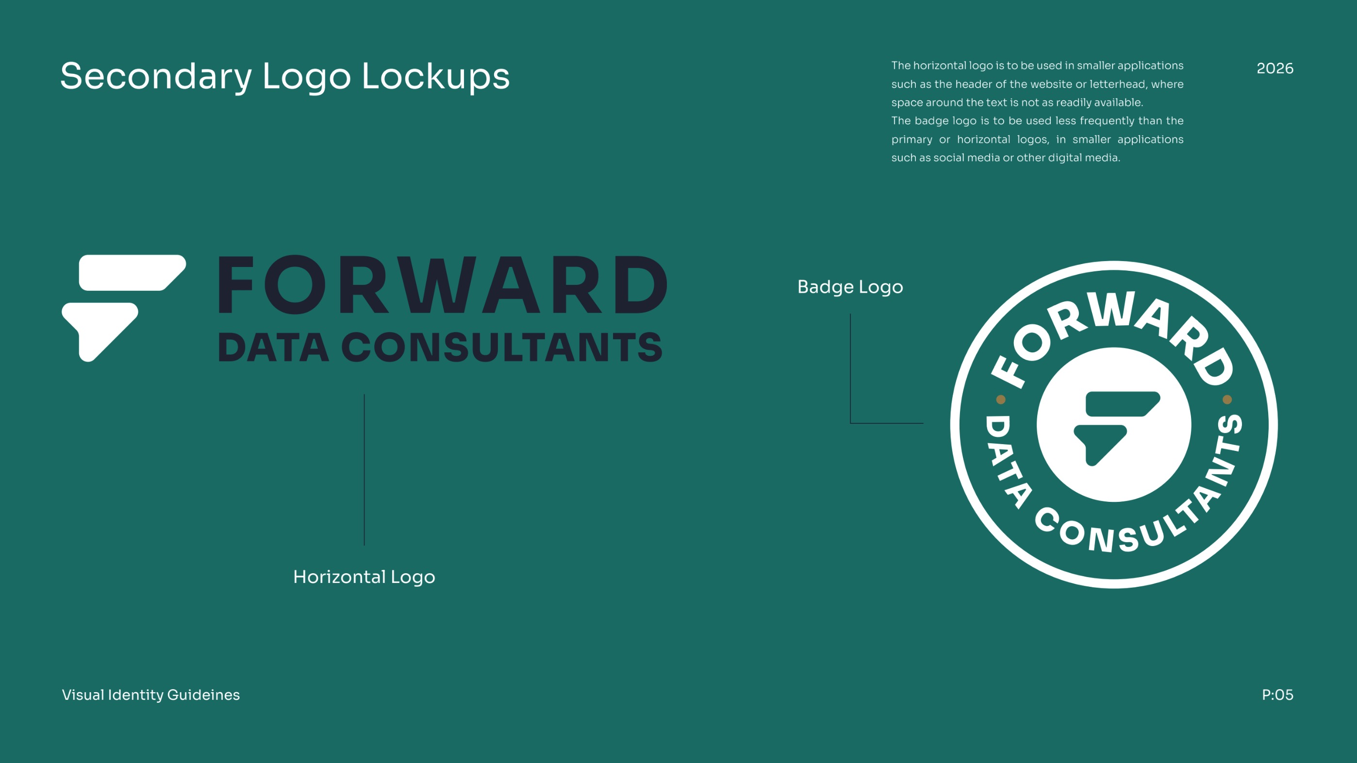
We developed the core identity elements, including the primary logo, secondary logo, typography, color palette, and brand guidelines. Each piece was built to work together so Forward could show up consistently across its website, marketing materials, print assets, and future campaigns.
The brand direction avoided the easy clichés of the technology space. Instead of leaning on overly futuristic visuals or generic digital motifs, the identity focused on professionalism, clarity, and trust.
The result was a brand that felt sharp without being cold, modern without being gimmicky, and technical without feeling inaccessible.
Original Photography


A new website can only feel so authentic when every image comes from a stock library.
Forward needed visual content that reflected the real people, tone, and professionalism behind the company. So we planned and executed a custom photo shoot to gather the imagery needed for launch.
The goal was not to overproduce the company or make it feel artificial. The goal was to create a clean, professional visual library that supported the website and gave the brand a more human presence.
That photography became an important part of the overall system. It helped the website feel less abstract, gave prospects a clearer sense of the people behind the work, and created usable assets Forward could continue to rely on beyond launch.
Website Foundation
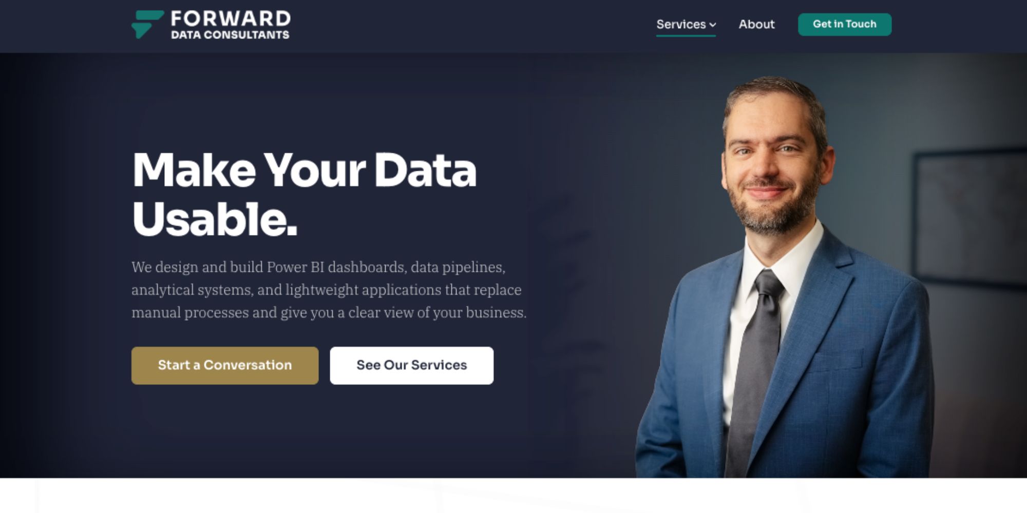
Once the brand and photography were in place, Page50 carried that direction into the website.
The website needed to introduce the company, support trust, communicate professionalism, and align visually with the new identity.
The site was built around the same principles as the brand: clarity, credibility, and usability. The visuals, photography, typography, and messaging all needed to feel like they belonged to the same company.
For a new business, that kind of consistency matters. A polished website gives prospects, partners, and stakeholders a place to understand who the company is, what it does, and why it can be trusted.
Deliverables
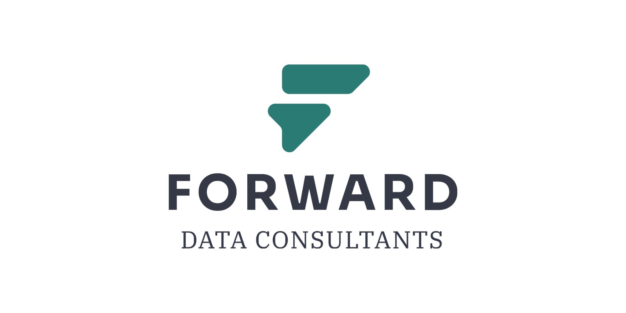
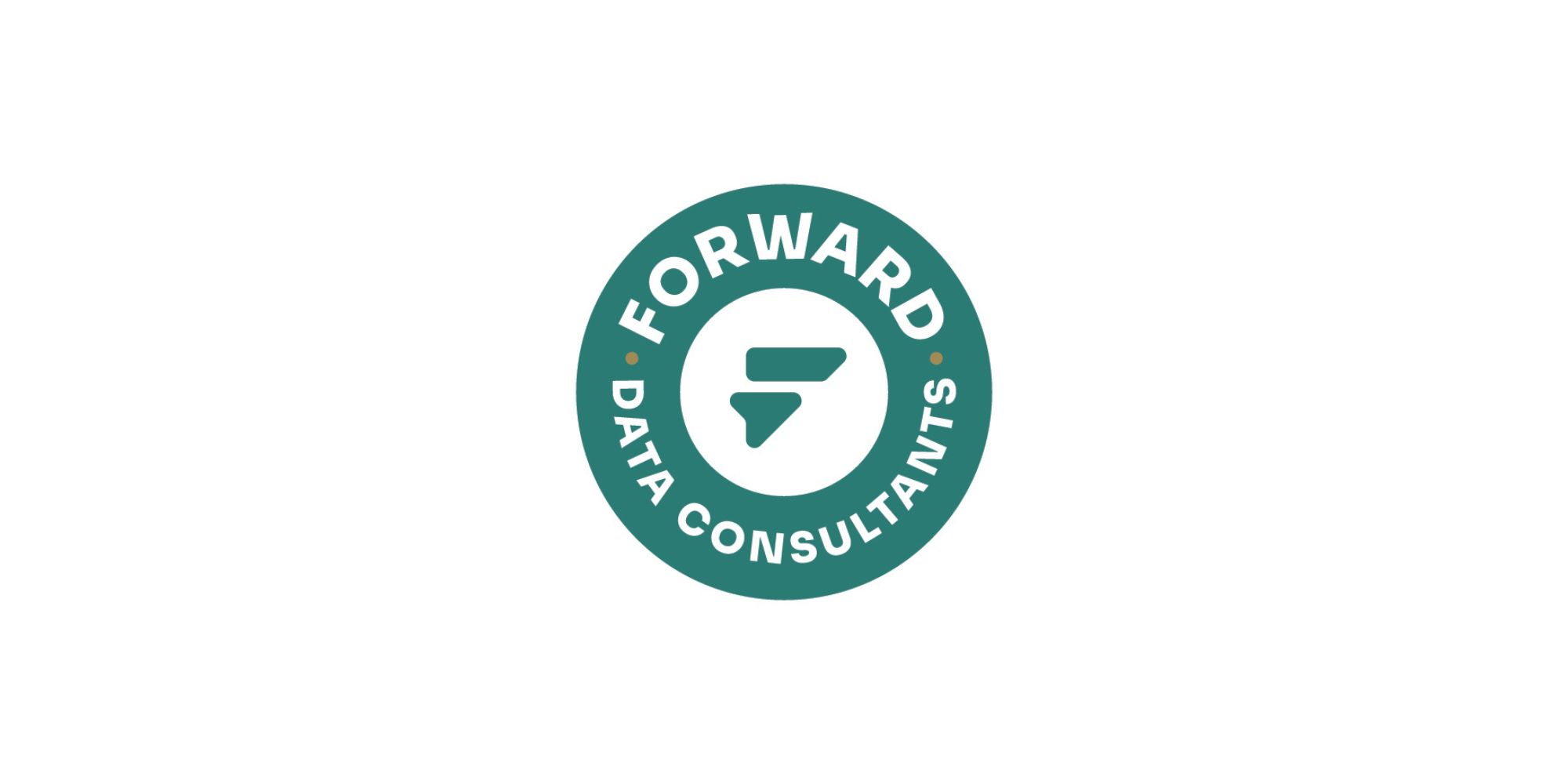
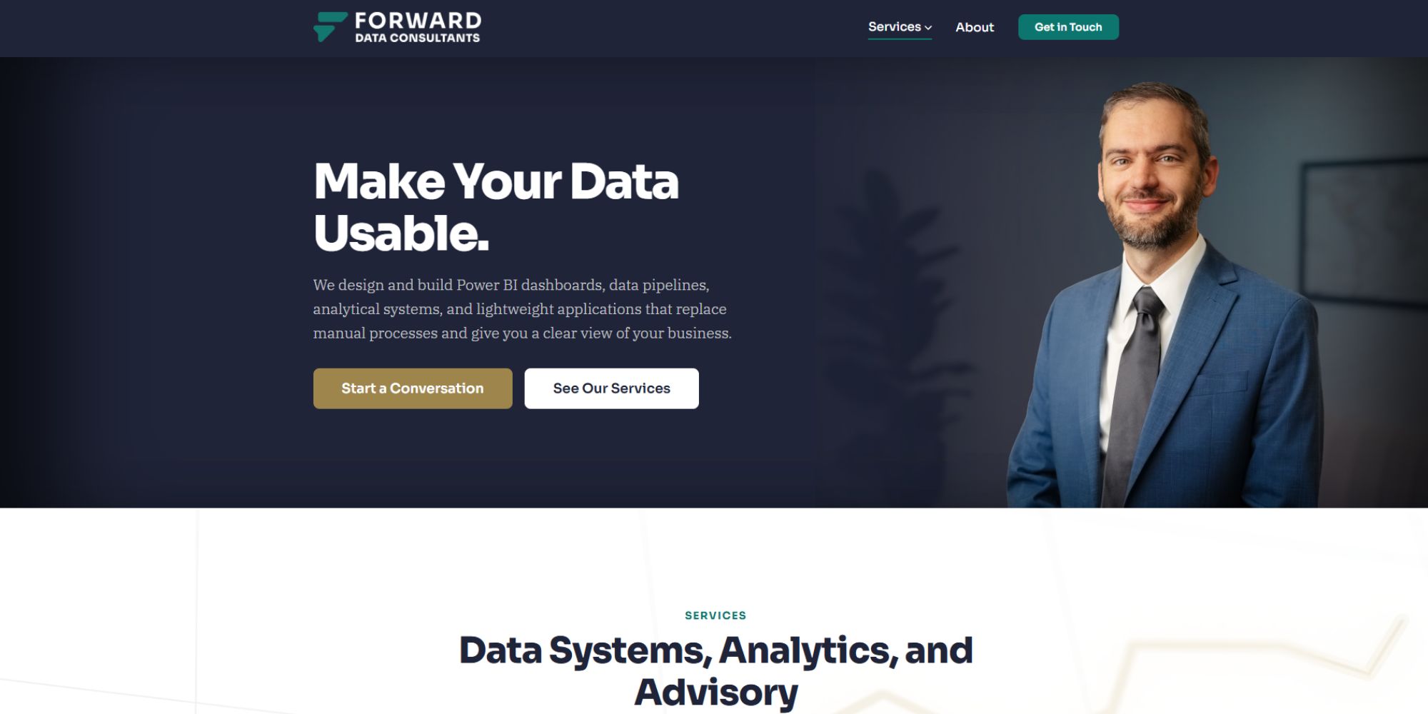
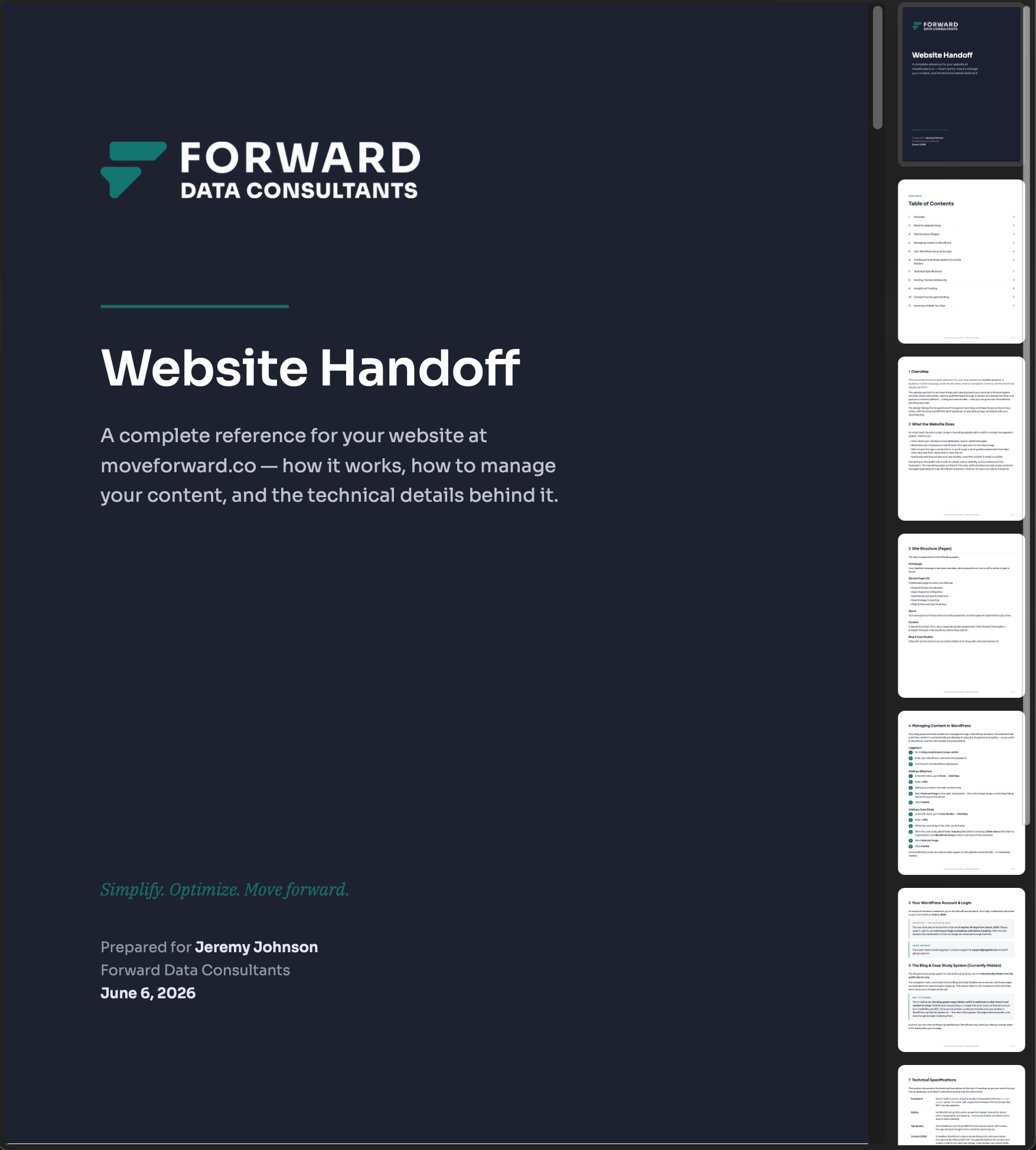
Together, these pieces gave Forward a complete professional presence: a brand system for consistency, original photography for authenticity, and a website built to support credibility from the first impression.
Impact
Forward went from a blank slate to a launch-ready brand and website.
Before the project, there was no formal identity, no website, and no original visual content library. Afterward, Forward had a cohesive system that could support its public launch, sales conversations, marketing materials, and long-term brand consistency.
The final brand gave the company a clean, intelligent look that aligned with its values and positioning. The photography made the website feel more authentic and personal. The website gave prospects and partners a clear place to understand who Forward is, what it does, and why it can be trusted.
Because Forward was a new company, the value of the work was foundational. Page50 helped create the visual, content, and digital infrastructure needed for the company to show up with confidence.
The result was a brand that matched the work behind it: strategic, professional, and built for a company ready to move forward.
What We Did
Brand & Identity
- Brand strategy
- Logo design
- Visual identity development
- Brand guidelines
- Typography and color system
Content & Photography
- Photo shoot planning
- Photography
- Website content gathering
Website Design & Development
- Website design
- Website development
- Project management
- Creative consultation